The Typography Mystery Hidden in Every Design Tool

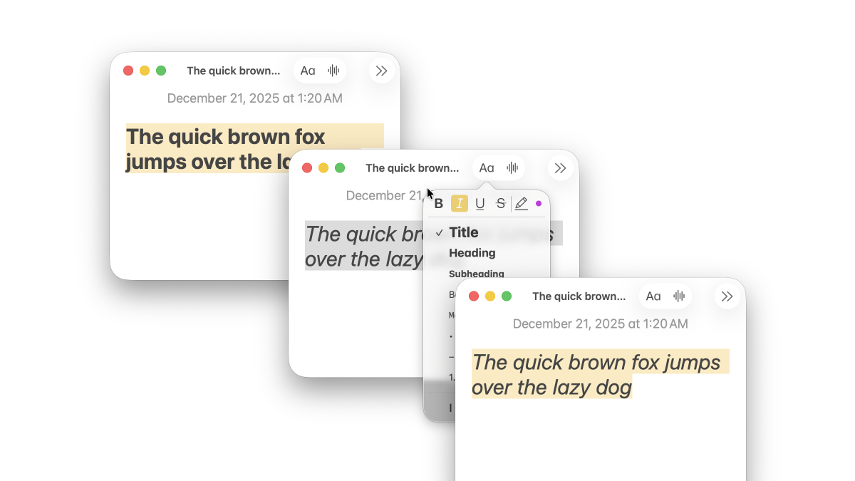
That little Italic toggle in your design tool is doing far more than leaning letters to the right. In a professional renderer, italic is a font discovery and selection problem—and it’s messy in ways most people never see.
Clicking Italic is a request for a specific typographic design: a distinct face (often with different letterforms, spacing, and metrics), ideally authored by the type designer. To honor that request, a design tool has to navigate:
- families shipped as one file vs many files
- variable fonts that may or may not expose a real italic axis
- fonts that express italic via metadata (or don’t)
- legacy naming conventions that conflict with modern specs
In other words: the UI is simple. The decision tree is not.
Thesis: A design tool can’t “apply italic.” It can only select a font face (or instance) that represents italic, or choose a synthetic fallback.
What you think italic is
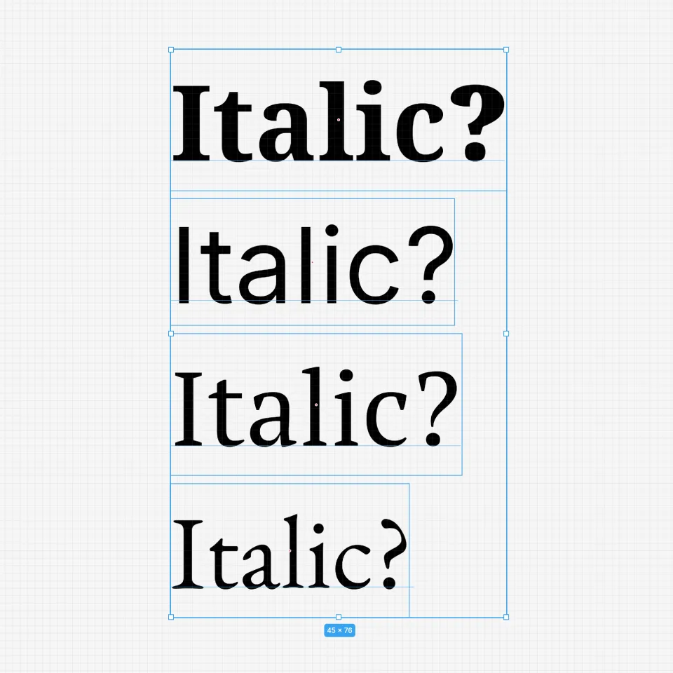
From the outside, italic looks like a geometric effect. But “true italic” is a separate design, not a shear transform:
- the italic a and g may change shape
- spacing and kerning can be rebalanced for slanted rhythm
- strokes, terminals, and proportions may be reworked for readability
So a professional tool should prefer a genuine italic face when it exists. And when it doesn’t, it must decide what “italic” should mean in a way that’s consistent, debuggable, and cross-platform.
Why italic gets complicated in modern font families
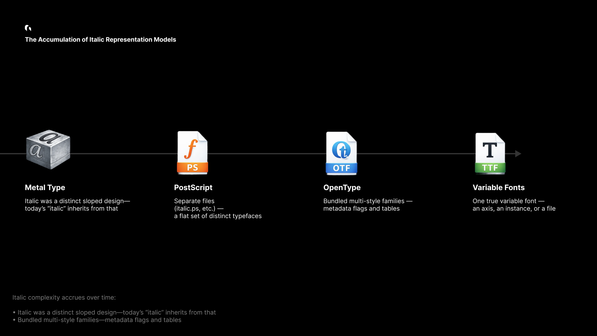
Italic complexity isn’t an accident—it’s an accumulation:
- History: italic was originally a distinct handwriting-inspired style, not merely “slanted roman.”
- File formats: font families evolved from separate files to large multi-style bundles to variable fonts.
- Metadata: different eras standardized different signals (and not all fonts implement them correctly).
Today, the same user intent (“italic”) can be represented by very different font packaging strategies.
The family taxonomy: how italic is actually shipped

Modern font families implement italic in a small number of patterns. The table below is the practical taxonomy we use when analyzing large registries (e.g., Google Fonts).
Read this as: same UI button, different ground truth.
| Scenario | Description | Non-Italic Examples | Italic Examples | Primary signal | Notes |
|---|---|---|---|---|---|
| 1. One static font | Single file; italic may be absent—or the family may be italic-only. | Allerta-Regular.ttf (Google Fonts) | Molle-Italic.ttf (Google Fonts) | OS/2 | Rare edge cases exist (including “italic-only” families). |
| 2. Many static fonts | Multiple files (Regular/Bold/Italic/BoldItalic). | PTSerif-Regular.ttf, PTSerif-Bold.ttf (Google Fonts) | PTSerif-Italic.ttf, PTSerif-BoldItalic.ttf (Google Fonts) | OS/2 | The traditional, still-common packaging model. |
| 3. One variable font | A single variable font that can express italic via axes. | Geist-VariableFont_wght.ttf (Google Fonts) | EB Garamond (legacy reference) (Google Fonts Knowledge) | ital axis | Elegant in theory, less common in practice than people assume. |
| 3-1. VF + italic instances | Variable font uses slnt plus explicitly named italic instances. | Recursive-VariableFont_CASL,CRSV,MONO,slnt,wght.ttf (Google Fonts)RobotoFlex-VariableFont_GRAD,XOPQ,XTRA,YOPQ,YTAS,YTDE,YTFI,YTLC,YTUC,opsz,slnt,wdth,wght.ttf (Google Fonts) | Same files, via named instances | fvar.instances / STAT | Italic is expressed by instances and names, not a clean “OS/2 italic” bit. |
| 4. Two variable fonts | A Roman VF and an Italic VF, switched by style. | Inter-VariableFont_opsz,wght.ttf (Google Fonts)NotoSans-VariableFont_wdth,wght.ttf (Google Fonts) | Inter-Italic-VariableFont_opsz,wght.ttf (Google Fonts)NotoSans-Italic-VariableFont_wdth,wght.ttf (Google Fonts) | OS/2 + family packaging | Common in modern flagship families: distinct design + VF benefits. |
This taxonomy is the reason a single “isItalic” heuristic fails: italic may be a dedicated file, a variable axis value, a named instance, or—occasionally—an entire family.
A professional font engine needs a policy, not a trick
If italic were always signaled the same way, font selection would be trivial.
In practice:
- Some fonts set OS/2 flags reliably. Others don’t.
- Some variable fonts expose an
italaxis. Others useslnt. - Some fonts contain “Italic” in names without being true italic.
- Some families include an italic VF as a separate file.
A design tool therefore needs two things:
- A detection pipeline that can interpret multiple sources of truth.
- A policy that defines what counts as “italic” when signals disagree.
Grida’s italic selection pipeline
Grida’s selection is intentionally priority-based. The goal is not to be clever; it’s to be consistent.
Priority order
- User declaration (explicit intent wins)
- OS/2 italic bit (best broad signal)
- STAT table (style semantics and instance mapping)
- Variable font axes (
ital, thenslntwith named instances) - Name table fallback (optional, logged)
The decision flow
Two important details:
- We treat italic as a semantic request, not as a geometric one.
- When we must fall back, we do it explicitly and log the reason.
From selection to rendering: a stable style model
Italic detection only matters if the result can be reliably rendered, cached, and persisted.
The key design constraint is this:
A stored text style should contain facts (what the user asked for, what we resolved to), not platform-specific assumptions.
FontStyleKey
This structure is the bridge between selection and rendering:
pub struct FontStyleKey {
    // Core identity
    pub font_family: String,
    pub font_weight: FontWeight,
    pub font_style_italic: bool,

    // Optional precision (exact matching)
    pub font_style_name: Option<String>,
    pub font_postscript_name: Option<String>,
    pub font_instance_postscript_name: Option<String>,
    pub font_variations: Option<HashMap<String, f32>>,
}
Why the split matters:
- The core fields cover the common case and enable fast internal resolution.
- The optional fields provide exactness when it exists (static PostScript names, VF instance names, axis values).
- Nothing here assumes a filesystem location or OS font registry behavior.
Skia integration (illustrative)
// Illustrative sketch: production code includes additional validation & fallbacks.
fn textstyle(style: &TextStyleRec, ctx: &TextStyleRecBuildContext)
  -> skia_safe::textlayout::TextStyle
{
    let mut ts = skia_safe::textlayout::TextStyle::new();

    let font_style = skia_safe::FontStyle::new(
        skia_safe::font_style::Weight::from(style.font_weight.value() as i32),
        skia_safe::font_style::Width::NORMAL,
        if style.font_style_italic {
            skia_safe::font_style::Slant::Italic
        } else {
            skia_safe::font_style::Slant::Upright
        },
    );

    // Variable font coordinates (if any)
    let mut coords = vec![];
    if let Some(vars) = &style.font_variations {
        for v in vars {
            let tag = tag_from_str(&v.axis);
            coords.push(skia_safe::font_arguments::variation_position::Coordinate {
                axis: tag,
                value: v.value,
            });
        }
    }

    // Always apply weight
    coords.push(var_wght(style.font_weight.value() as f32));

    let variation_position = skia_safe::font_arguments::VariationPosition {
        coordinates: coords.as_slice(),
    };

    ts.set_font_style(font_style);
    ts.set_font_arguments(&font_args);
    ts
}
The goal is straightforward: once italic is classified (and a recipe exists), it must round-trip into the renderer deterministically.
Deep dive: persistence, portability, and edge cases
Design tools aren’t browsers. They store documents, share files, and expect styles to remain meaningful over time.
Persistence principles
- Facts only: store what’s true about the style and resolution.
- Platform agnostic: no font file paths or OS-specific identifiers.
- Graceful degradation: if a platform can’t locate the exact face, it should still render a sensible fallback.
Real-world pressure points
- Font file variability: “the same family” can ship different files per platform.
- Variable font instances: the file may be constant; the instance is the real style.
- Metadata quality: fonts in the wild are inconsistent; the pipeline must be defensive.
- Performance: selection must be cacheable and fast at design-tool scale.
Blink, Grida, and Skia: where selection lives
A useful mental model:
- Blink (in the browser) decides fonts in the context of CSS, platform font fallback, and webfont loading.
- Grida decides fonts in the context of documents, portability, and design intent.
- Skia renders the result: it needs a resolved typeface + style/variation inputs.
The main takeaway is that “italic” is not solved at the raster layer. It’s solved in the selection layer—before glyph shaping and rendering.
// Illustrative: classification is a policy-driven decision.
fn classify_face(face: &FaceRecord) -> (ItalicKind, Option<Recipe>) {
    if face.user_font_style_italic == Some(true) {
        return (ItalicKind::Italic, None);
    }

    if face.os2_fsselection.italic() {
        return (ItalicKind::Italic, None);
    }

    if face.has_ital_axis_default_one() {
        return (ItalicKind::Italic, Some(Recipe::ital_one()));
    }

    if face.has_slnt_axis() {
        if let Some(inst) = face.instance_named_italic_via_slnt_only() {
            return (ItalicKind::Italic, Some(inst.axis_recipe()));
        }
    }

    (ItalicKind::Normal, None)
}
Real italic vs synthetic italic
When an authentic italic face exists, it preserves typographic intent. When it doesn’t, tools often use a synthetic fallback.
A practical rule:
- Prefer real italic when the family provides it.
- Fallback to synthetic only when there’s no reliable italic face/instance.
The mistake is treating synthetic slant as equivalent. It isn’t—but it can be a reasonable fallback if communicated and applied consistently.
Why we built fonts.grida.co
To validate this pipeline at scale, we built fonts.grida.co—a font metadata indexing service used to test and audit italic behavior across large registries.
It provides:
- accurate PostScript name mappings
- per-variant previews
- variable font axis and instance introspection
- searchable metadata for edge-case discovery
In practice, the service acts as an externalized test harness for font selection correctness.
Closing: the small button with big consequences
Italic is a good example of what makes professional design tools hard: correctness is often invisible, and failure looks “almost fine.”
Treating italic as a first-class selection problem—backed by a clear policy, robust metadata interpretation, and stable persistence—turns a fragile UI toggle into something you can trust in real documents.
The italic button is small. The responsibility behind it is not.