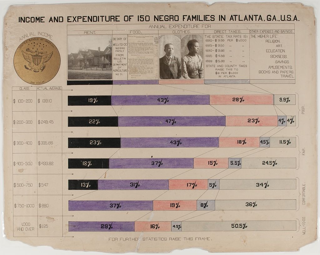
The image is a vintage chart titled "Income and Expenditure of 150 Negro Families in Atlanta, Ga., U.S.A.". It's a detailed breakdown of how families with different income levels spend their money. The chart is organized into rows representing income classes, ranging from "$100-200" to "1,000 and over". Each row is divided into colored segments representing the percentage of income spent on various categories like rent, food, clothes, direct taxes, other expenses and savings. On the left side, there's a small image of the Seal of the United States. There's also a small black and white photograph of a family, likely to illustrate the subject of the chart. The chart uses a color-coded system to represent different expenditure categories: * **Rent:** Shades of orange and yellow. * **Food:** Shades of pink. * **Clothes:** Shades of purple. * **Direct Taxes:** Light blue. * **Other Expenses and Savings:** Various shades of green, pink, and purple. * **Religion, Education, Sickness, Savings, Amusements, Books and Papers, Travel:** Various shades of pink, purple, and green. The chart also includes notes about state and county taxes in Atlanta. The overall aesthetic is vintage, with a slightly faded and aged appearance.