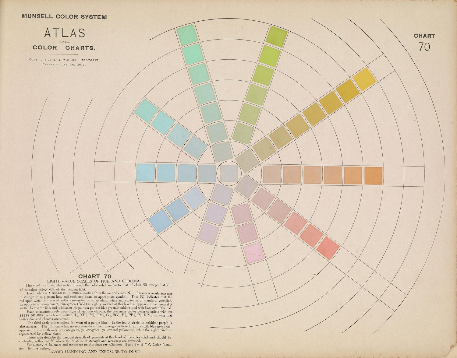
The image is a vintage chart titled "Munsell Color System Atlas" and specifically "Chart 70". It's a complex visual diagram used for understanding color relationships. The chart is dominated by a circular arrangement of colors, resembling a color wheel, but it's more intricate than a simple wheel. It's a visual representation of hue, value, and chroma. The center of the chart is a neutral gray scale, transitioning from white to black. Radiating outwards from this center are concentric circles representing different levels of chroma (color purity). Within each chroma level, colors are arranged in a circular fashion, representing different hues. The hues range across the spectrum – reds, yellows, greens, blues, and purples. The colors are not uniformly distributed; they are arranged to demonstrate how hue, value, and chroma interact. There's a lot of text accompanying the chart, explaining the principles of the Munsell color system. The text describes the arrangement of hues, the scale of chroma, and the relationship between value and chroma. It also mentions the use of the chart for matching colors and understanding color harmony. The chart has a vintage aesthetic, with a slightly faded and aged appearance. The colors are not as vibrant as modern color charts, but they are still distinguishable and informative. The overall impression is one of scientific precision and artistic expression.