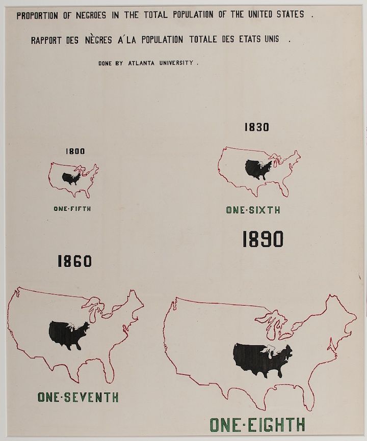
The image is a historical chart titled "Proportion of Negroes in the Total Population of the United States" and its French translation, "Rapport des Nègres à la Population Totale des États Unis". It was done by Atlanta University. The chart displays four maps of the United States, each representing a different year: 1800, 1830, 1860, and 1890. Each map shows the continental United States outlined in a thin red line. Within each map, a dark, solid shape represents the proportion of the African American population in that year. The size of the dark shape decreases over time, indicating a declining proportion of the total population. Below each map is text indicating the year and the corresponding proportion: * **1800:** One-Fifth * **1830:** One-Sixth * **1860:** One-Seventh * **1890:** One-Eighth The chart is presented on a cream-colored background. The text and proportions are in a dark green color. The overall style is reminiscent of early data visualization techniques, with a focus on simple shapes and clear labeling.