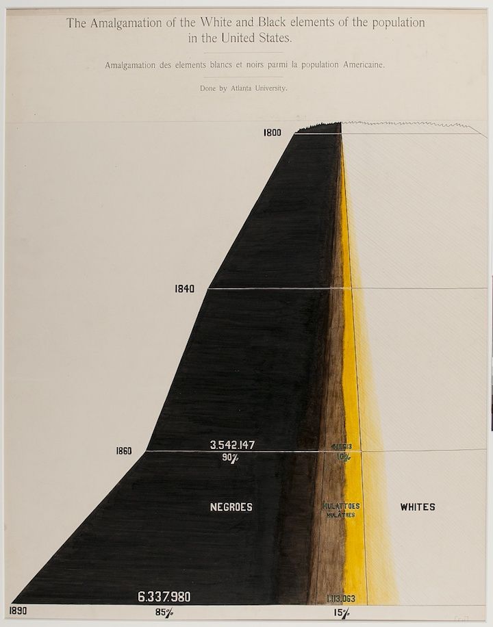
This is a vintage diagram titled "The Amalgamation of the White and Black elements in the United States." It's a visual representation of racial demographics over time, created by Atlanta University. The diagram is a large, triangular area divided into three sections: a dark black area representing "Negroes," a lighter yellow/gold area representing "Whites," and a narrow, textured area in between labeled "Mulattoes." The diagram shows how the proportions of these groups changed from 1800 to 1890. * **1800:** The black area dominates, with a very small white area and an even smaller mulatto area. * **1840:** The white area has grown, but the black area still dominates. * **1860:** The diagram shows numbers and percentages: 3,542,147 Negroes (90%) and 106,063 Mulattoes (10%). * **1890:** The diagram shows numbers and percentages: 6,337,980 Negroes (85%) and 1,113,063 Mulattoes (15%). The diagram is a historical document, likely intended to illustrate the changing racial composition of the United States and the impact of amalgamation (interracial mixing). The style is reminiscent of W.E.B. Du Bois's data visualizations, known for their use of color and graphic representation of social issues. The diagram is set against a cream-colored background. There is French text at the top of the diagram: "Amalgamation des elements blancs et noirs parmi la population Americaine." Overall, the image is a striking and informative piece of historical data visualization.