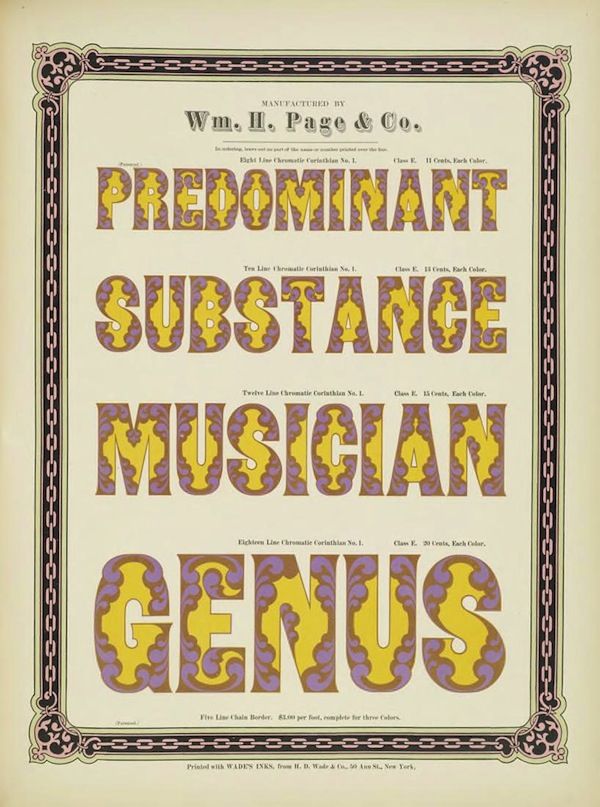
The image is a vintage lithograph advertising the chromatic lettering styles of Wm. H. Page & Co. It has a pale yellow background with a decorative, ornate border in shades of brown and black. The central focus is the display of four words, each rendered in a different chromatic lettering style. The words are: * **PREDOMINANT** - in a bold, yellow font with a purple vine-like pattern filling the letters. * **SUBSTANCE** - similar to the first, with yellow letters and a purple pattern. * **MUSICIAN** - again, yellow letters with a purple pattern. * **GENIUS** - the same style as the others. Above the words, in smaller text, is the company name: “Wm. H. Page & Co.” Below each word, there is text indicating the style of lettering (e.g., “Eight Line Chromatic Corinthian No. 1”) and the price per color. At the very bottom, there is a line of text indicating the ink used: “Printed with WADEN’S INK, from H. W. Wade & Co., 30 Ann St., New York.” The overall aesthetic is Victorian and ornate, typical of advertising from the late 19th or early 20th century. The use of chromatic lettering, where the letters are filled with intricate patterns, was a popular technique at the time.