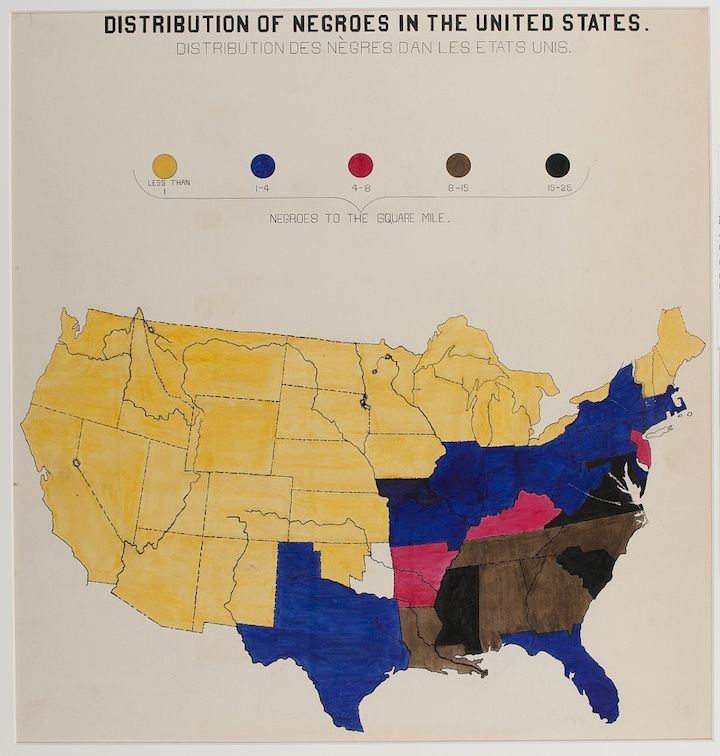
The image is a map of the United States titled "Distribution of Negroes in the United States." and its French translation. The map is color-coded to show the density of the African American population per square mile. The color key at the top indicates the following densities: * **Less than 1:** Yellow * **1-4:** Blue * **4-8:** Pink * **8-15:** Gray * **15-25:** Brown The Southern states, particularly along the Atlantic coast and in the Deep South, are predominantly colored in darker shades of brown and gray, indicating a higher concentration of African Americans. The states of Virginia, North Carolina, South Carolina, Georgia, Alabama, Mississippi, and Louisiana are heavily shaded. The states of Texas, Arkansas, and Tennessee also show significant concentrations. The rest of the country, including the Western and Midwestern states, is largely colored in yellow and blue, indicating a lower concentration of African Americans. The map appears to be from a historical period, likely the early to mid-20th century, given the terminology used and the distribution patterns shown. The map has a slightly aged appearance, with some discoloration and wear around the edges.