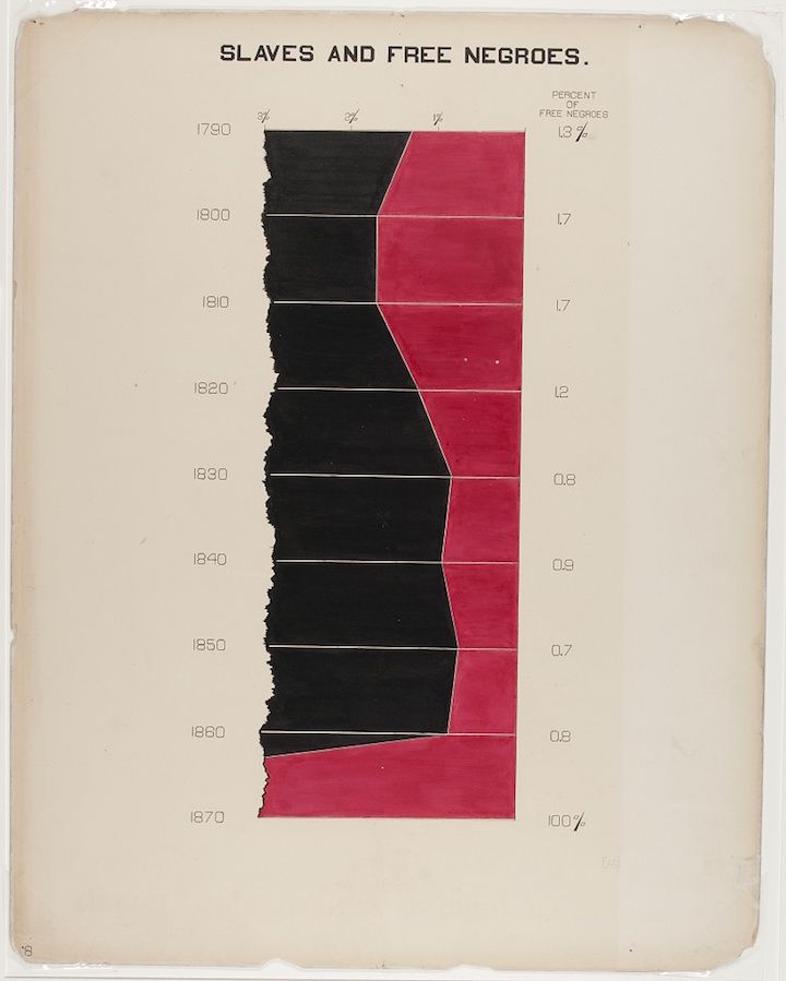
The image is a historical graph titled "Slaves and Free Negroes". It's a stacked area chart showing the percentage of slaves and free negroes from 1790 to 1870. The chart has a vertical axis representing years, ranging from 1790 to 1870 in 10-year increments. The horizontal axis represents the percentage of free negroes. The area representing slaves is filled with black, while the area representing free negroes is filled with a reddish-pink color. The black area dominates the chart until around 1840, gradually decreasing as the reddish-pink area increases. By 1870, the reddish-pink area fills the entire chart, indicating 100% of the population were free negroes. Numbers are placed to the right of each section, indicating the percentage of free negroes for each year. The numbers range from 1.7% in 1800 to 100% in 1870. The chart is on a cream-colored background, and there's a small number '8' in the bottom left corner. The overall impression is a visual representation of the changing demographics of enslaved and free African Americans over time.