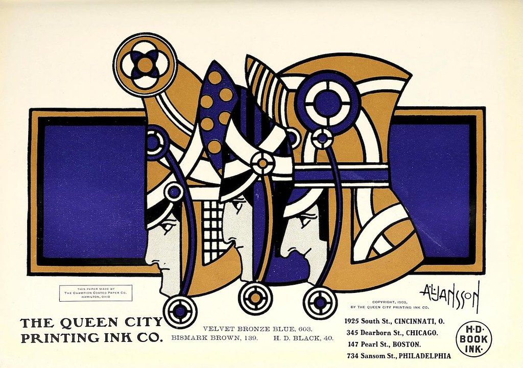
The image is a vintage advertisement or promotional piece for 'The Queen City Printing Ink Co.' It features a highly stylized, symmetrical illustration reminiscent of Art Nouveau or Art Deco design. The central motif is a butterfly-like figure, constructed from geometric shapes and intricate patterns. The wings are divided into sections of gold, blue, and brown, with repeating circular and linear designs. The body of the butterfly is a complex arrangement of lines and shapes, also in gold, blue, and brown. The illustration is framed by a bold, geometric border in shades of gold and blue. The background is a vibrant red, which makes the colors of the illustration and border pop. Below the illustration, the text 'THE QUEEN CITY PRINTING INK CO.' is prominently displayed. To the right, there's a signature that appears to read 'Atanasson'. On the lower right corner, there's a small circular logo with the text 'H.D. BOOK INK'. To the right of the illustration, there's a list of addresses: '1925 South St., CINCINNATI, O.', '345 Dearborn St., CHICAGO.', '147 Pearl St., BOSTON.', '734 Sansom St., PHILADELPHIA.' Below the company name, there's a list of ink colors and numbers: 'VELVET BRONZE BLUE. 603.', 'BISMARK BROWN 139.', 'H.D. BLACK. 40.' In the upper left corner, there's a small text that reads 'THIS PAPER MADE BY THE CHAMPION PAPER CO. HAMILTON, OHIO.' The overall aesthetic is highly decorative and suggests a focus on quality and craftsmanship in printing inks.