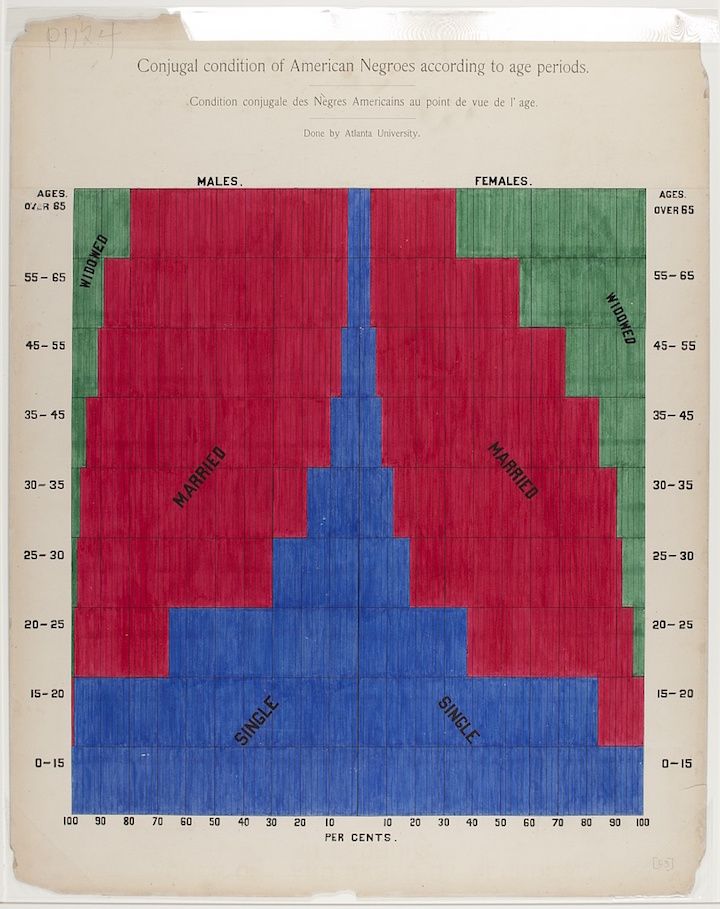
The image is a chart titled "Conjugal condition of American Negroes according to age periods." It's a stacked bar graph comparing the marital status of males and females across different age groups. The chart is divided into two main sections: "MALES" on the left and "FEMALES" on the right. Each section is further divided into age groups listed vertically on the left and right sides, ranging from 0-15 to over 65. The marital status categories – “SINGLE” (blue), “MARRIED” (red), and “WIDOWED” (green) – are represented by stacked rectangles within each age group. The horizontal axis at the bottom shows percentages, ranging from 0 to 100. The chart visually displays the distribution of marital status within each age group for both males and females. For example, in the 0-15 age group, both males and females are predominantly single (blue). As age increases, the proportion of married individuals (red) increases, while the proportion of widowed individuals (green) becomes more significant in the older age groups. The chart is labeled with the text "Condition conjugale des Nègres Américains au point de vue de l'age" and "Done by Atlanta University". The chart is slightly aged and has some discoloration, suggesting it is a historical document. There are also some handwritten markings and annotations on the chart.