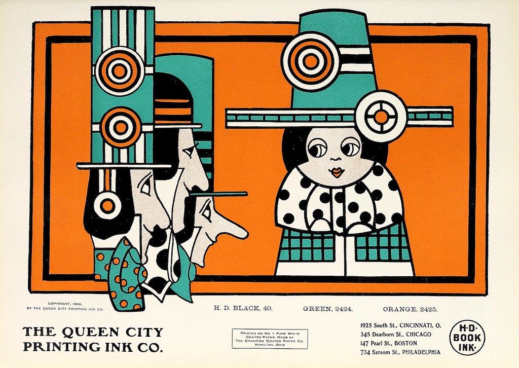
The image is a vintage advertisement for The Queen City Printing Ink Co. It features a bold, geometric illustration in a limited color palette of black, orange, and teal. The illustration is divided into two main sections. On the left is an abstract composition of stacked, cylindrical shapes and angular lines, resembling a stylized building or machine. On the right is a portrait of a woman with a bob haircut and a polka dot dress. Her face is rendered in a simplified, graphic style with large eyes and a small mouth. The background is a bright orange, and the illustration is framed by a black border. Below the illustration is the company name, “The Queen City Printing Ink Co.” in large, bold letters. Below that is a list of ink colors (H.D. Black 40, Green 2424, Orange 2425) and a list of company addresses in Cincinnati, Chicago, Boston, and Philadelphia. The bottom right corner features a small logo with the letters “H-D BOOK INK.” The overall style is reminiscent of Art Deco or Constructivism, with a focus on geometric shapes and bold colors. The advertisement is printed on what appears to be a textured paper, and there is a note indicating that it was printed on “No. 1 Pure White Champion Coated Paper.”